Main Content

mairplot

Create intensity versus ratio scatter plot of microarray data

    Description

    mairplot(DataX,DataY) creates a scatter plot that plots log10 of the product of the DataX and DataY intensities versus log2 of the intensity ratios.

    [Intensity,Ratio] = mairplot(DataX,DataY) returns the intensity and ratio values. If you set Normalize to true, the returned ratio values are normalized.

    [Intensity,Ratio,H] = mairplot(DataX,DataY) returns the handle to the plot. Use H to modify the plot after it is created.

    ___ = mairplot(DataX,DataY,Name=Value) specifies additional options using one or more name-value arguments. Use any arguments from the previous syntaxes.

    example

    Examples

    collapse all

    Load a sample GPR file containing microarray data.

    maStruct = gprread("mouse_a1wt.gpr");

    Extract the green (cy3) and red (cy5) signals from the data.

    cy5data = magetfield(maStruct,"F635 Median");
    cy3data = magetfield(maStruct,"F532 Median");

    Create an intensity versus ratio scatter plot of the cy3 and cy5 data. Normalize the data and add a title and labels.

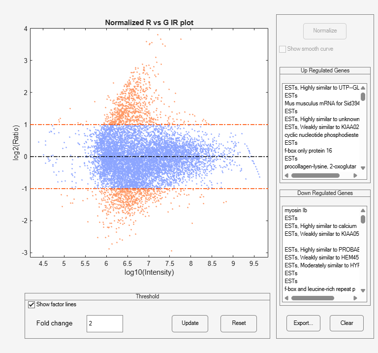
    mairplot(cy5data,cy3data,Normalize=true, ...
             Title="Normalized R vs G IR plot", ...
             Labels=maStruct.Names);

    Figure MAIRPlot contains an axes object and other objects of type uipanel. The axes object with title Normalized R vs G IR plot, xlabel log10(Intensity), ylabel log2(Ratio) contains 4 objects of type patch, line. These objects represent Ratio, Zero ratio, Ratio threshold.

    Create a normalized microarrray plot of the cy3 and cy5 data without the user interface components.

    mairplot(cy5data,cy3data,Normalize=true,Type="MA",PlotOnly=true);

    Figure contains an axes object. The axes object with title MA plot, xlabel A, ylabel M contains 4 objects of type patch, line. These objects represent Ratio, Zero ratio, Ratio threshold.

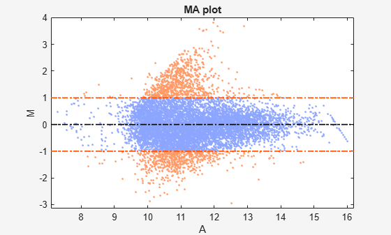
    The intensity versus ratio scatter plot displays the following:

    • log10 (Intensity) versus log2 (Ratio) scatter plot of genes.

    • Two horizontal fold change lines at a fold change level of 2, which corresponds to a ratio of 1 and –1 on a log 2 (Ratio) scale. Lines will be at different fold change levels, if you used the FactorLines argument.

    • Data points for genes that are considered differentially expressed (outside of the fold change lines) appear in orange.

    After you display the intensity versus ratio scatter plot, you can interactively do the following:

    • Adjust the horizontal fold change lines by click-dragging one line or entering a value in the Fold Change text box, then clicking Update.

    • Display labels for data points by clicking a data point.

    • Select a gene from the Up Regulated or Down Regulated list to highlight the corresponding data point in the plot. Press and hold Ctrl or Shift to select multiple genes.

    • Zoom the plot by selecting Tools > Zoom In or Tools > Zoom Out.

    • View lists of significantly up-regulated and down-regulated genes, and optionally, export the gene labels and indices to a structure in the MATLAB® Workspace by clicking Export.

    • Normalize the data by clicking the Normalize button, then selecting whether to show the normalized plot in a separate window. If you show the normalized plot in a separate window, the Show smooth curve check box becomes available in the original (unnormalized) plot.

    To select different lowess normalization options before normalizing, select Tools > Set LOWESS Normalization Options, then enter options in the Options for LOWESS dialog box.

    Input Arguments

    collapse all

    Intensity values, specified as a DataMatrix object or vector of gene expression values where each row corresponds to a gene. For example, in a two-color microarray experiment, DataX can be cy3 intensity values and DataY can be cy5 intensity values.

    Intensity values, specified as a DataMatrix object or vector of gene expression values where each row corresponds to a gene. For example, in a two-color microarray experiment, DataX can be cy3 intensity values and DataY can be cy5 intensity values.

    Name-Value Arguments

    collapse all

    Specify optional pairs of arguments as Name1=Value1,...,NameN=ValueN, where Name is the argument name and Value is the corresponding value. Name-value arguments must appear after other arguments, but the order of the pairs does not matter.

    Example: Normalize=true,Type="MA",PlotOnly=true

    Plot type, specified as "IR" or "MA".

    • "IR" plots log10 of the product of the DataX and DataY intensities versus log2 of the intensity ratios.

    • "MA" plots (1/2)log2 of the product of the DataX and DataY intensities versus log2 of the intensity ratios.

    Data Types: char | string

    Controls for conversion of data in DataX and DataY from natural to log 2 scale, specified as true or false. Set the value to false, when the data is already log2 scale. The default valuetrue assumes the data is natural scale.

    Data Types: logical

    Control to add lines to the plot showing a factor of N change, specified as a number. The default value 2 corresponds to a level of 1 and -1 on a log2 scale.

    Tip

    You can also change the factor lines interactively, after creating the plot.

    Data Types: double

    Plot title, specified as a string or character vector.

    Data Types: char | string

    Labels for the data, specified as a string vector or cell array of character vectors. If labels are defined, then clicking a point on the plot shows the label corresponding to that point.

    Data Types: string | cell

    Control for displaying lowess normalized ratio values, specified as true or false. If this value is set to true, the mairplot function displays lowess normalized ratio values.

    Tip

    You can also normalize the data from the MAIR Plot window, after creating the plot.

    Data Types: logical

    Lowess normalization options, specified as a cell array of one, two, or three of these name-value pair arguments: Order, Robust, Span. For more information on the name-value pair arguments, see malowess.

    Data Types: cell

    Control for displaying the scatter plot, specified as true or false.

    Data Types: logical

    Control for displaying the scatter plot without user interface components, specified as true or false.

    Note

    If you set PlotOnly to true, you can still display labels for data points by clicking a data point, and you can still adjust the horizontal fold change lines by click-dragging the lines.

    Data Types: logical

    Output Arguments

    collapse all

    Intensity values for the microarray gene expression data, returned as a DataMatrix object or a vector. The mairplot function calculates these values as follows:

    • When Type is set to "IR", the values are log10 of the product of the DataX and DataY intensities.

    • When Type is set to "MA", the values are (1/2)log2 of the product of the DataX and DataY intensities.

    Note

    If DataX or DataY is a DataMatrix object, then Intensity is also a DataMatrix object with the same properties.

    Ratios of the microarray gene expression data, returned as a DataMatrix object or a vector. The mairplot function calculates these values as log2(DataX./DataY).

    Note

    If DataX or DataY is a DataMatrix object, then Ratio is also a DataMatrix object with the same properties.

    References

    [1] Quackenbush, J. Microarray Data Normalization and Transformation. Nature Genetics suppl. 32 (2002): 496–501.

    [2] Dudoit, S., Y.H. Yang, M.J. Callow, and T.P. Speed. Statistical Methods for Identifying Differentially Expressed Genes in Replicated cDNA Microarray Experiments. Statistica Sinica 12 (2002): 111–139.

    Version History

    Introduced before R2006a