Control Bubbles in Standalone Geographic Bubble Charts
Customize a standalone geographic bubble chart created by the geobubble function by controlling the bubble sizes and bubble colors.
Standalone geographic bubble charts created by the geobubble function do not support customizations such as changing the line width and transparency of bubbles. To create a similar chart that supports more customizations, create a bubble chart in a geographic axes by using the geoaxes and bubblechart functions. For an example that uses the geoaxes and bubblechart functions, see Combine Bubble Chart with Other Graphics in Geographic Axes.
Load and Display Data
Read a table containing tsunami occurrences. Each table row represents a tsunami occurrence. The table variables include data about the tsunamis, such as the latitudes, longitudes, causes, and wave heights.
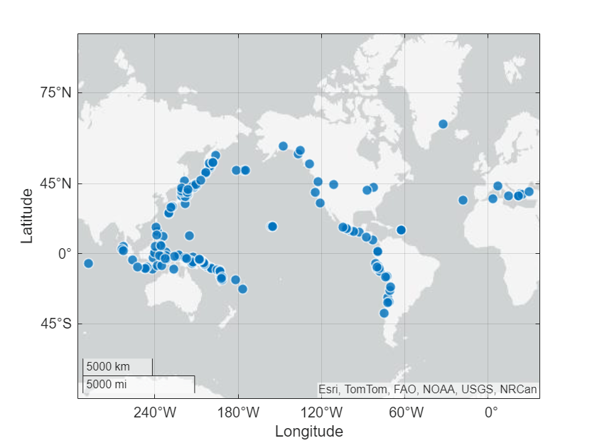
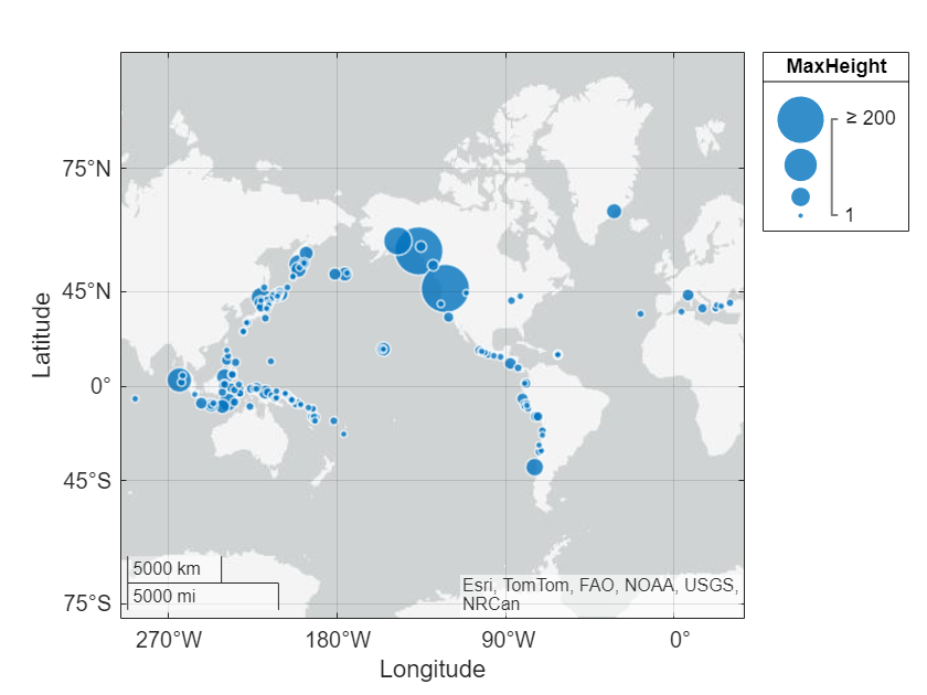
tsunamis = readtable("tsunamis.xlsx");Create a standalone geographic bubble chart from the table by using the geobubble function. Specify the tsunami locations using the Latitude and Longitude table variables. Return the GeographicBubbleChart object in gb. By default, all the bubbles are the same size and color.
gb = geobubble(tsunamis,"Latitude","Longitude");
Control Bubble Sizes
Visualize quantitative data in a bubble chart by changing the sizes of the bubbles. You can control the bubble sizes by changing the size data, the bubble width range, and the size limits.
Specify Size Data
The size data is the quantitative data that you want to visualize. When you pass a table to the geobubble function, specify the size data by setting the SizeVariable property of the GeographicBubbleChart object. Otherwise, use the SizeData property.
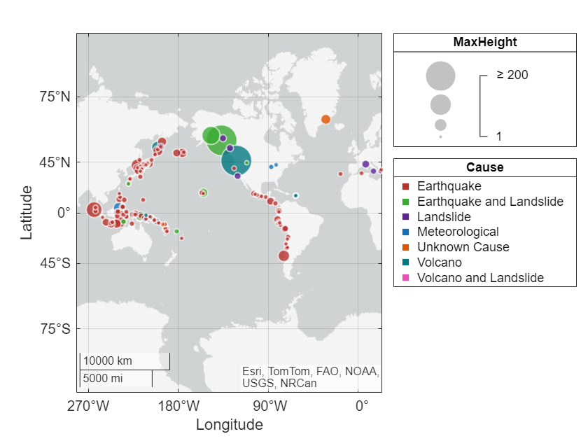
Specify the sizes of the bubbles using the wave heights stored in the MaxHeight table variable.
gb.SizeVariable = "MaxHeight";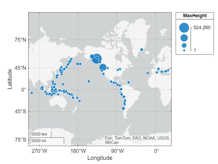
Change Bubble Diameters
The bubble width range specifies the diameters of the smallest and largest bubbles. Control the bubble width range by using the BubbleWidthRange property of the GeographicBubbleChart object.
Query the diameters of the smallest and largest bubbles. By default, the smallest bubble has a diameter of 5 points and the largest bubble has a diameter of 20 points.
gb.BubbleWidthRange
ans = 1×2

    5    20
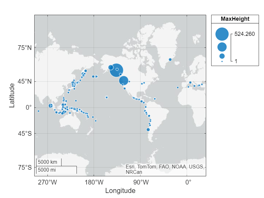
Decrease the diameter of the smallest bubble and increase the diameter of the largest bubble.
gb.BubbleWidthRange = [3 22];
Change Bubble Limits
The size limits control how MATLAB® maps the size data values to the bubble diameters. Control the size limits by using the SizeLimits property of the GeographicBubbleChart object.
Size values that are less than or equal to the minimum size limit map to the smallest diameter.
Size values that are greater than or equal to the maximum size limit map to the largest diameter.
Size values that are between the minimum and maximum size limits map linearly to diameters between the minimum and maximum diameters.
Query the size limits of the bubble chart. By default, the bubble chart object uses the minimum and maximum size data values.
gb.SizeLimits
ans = 1×2

    1.0000    524.2600
Decrease the upper size limit by changing the second element of the vector stored in SizeLimits.
gb.SizeLimits(2) = 200;
Control Bubble Colors
Visualize categorical data in a geographic bubble chart by changing the colors of the bubbles. You can control the bubble colors by changing the color data and the list of bubble colors.
Specify Color Data
The color data is the categorical data that you want to visualize. Standalone geographic bubble charts require categorical color data. In general, you can create categorical arrays by using the categorical or discretize function. When you pass a table to the geobubble function, specify the color data by setting the ColorVariable property. Otherwise, use the ColorData property.
Specify the bubble colors by using the tsunami causes stored in the Cause table variable. Convert the list of tsunami causes to a categorical array. Replace the missing causes with "Unknown Cause". Then, set the ColorVariable property of the bubble chart.
cats = categorical(tsunamis.Cause);
cats = fillmissing(cats,"constant","Unknown Cause");
gb.SourceTable.Cause = cats;
gb.ColorVariable = "Cause";
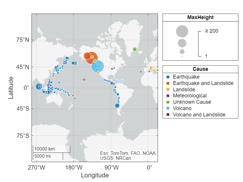
Specify List of Bubble Colors
By default, bubble charts cycle through a list of seven bubble colors. Specify the list of bubble colors by setting the BubbleColorList property of the GeographicBubbleChart object.
Get the colors of a predefined color palette by using the orderedcolors function. You can also get colors from a predefined colormap, such as turbo, or create custom colors using a matrix of RGB values. Then, specify the bubble colors for the bubble chart.
colors = orderedcolors("meadow");
gb.BubbleColorList = colors;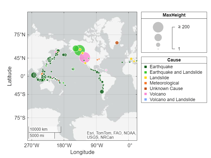
Alternatively, you can change the bubble colors by using the colororder function.
colororder("dye")