Accelerate Exploratory Programming Using the Live Editor
The following is an example of how to use the Live Editor to accelerate exploratory programming. This example demonstrates how you can use the Live Editor to:
See output together with the code that produced it.
Divide your program into sections to evaluate blocks of code individually.
Include visualizations.
Experiment with parameter values using controls.
Summarize and share your findings.
Load Highway Fatality Data
The Live Editor displays output together with the code that produced it. To run a section, go to the Live Editor tab and select the Run Section button. You can also click the blue bar that appears when you move your mouse to the left edge of a section.
In this example, we explore some highway fatality data. Start by loading the data. The variables are shown as the column headers of the table.
load fatalities
fatalities(1:10,:)ans=10×8 table
-107.5556 43.0327 164 380.1800 671.5290 9261 54 65.2257
-77.0269 38.8921 43 349.1220 240.4030 3742 12 100
-72.5565 44.0435 98 550.4620 551.5160 7855 20 38.1964
-99.4998 47.4691 100 461.7800 721.8350 7594 35 55.8072
-99.6790 44.2720 197 563.2980 882.7690 8784 76 51.9228
-75.4942 39.1071 134 533.9430 728.5240 9301 48 80.0211
-110.5763 46.8671 229 712.8800 1.0567e+03 11207 100 54.0310
-71.4337 41.5887 83 741.8410 834.5010 8473 41 90.9356
-71.5591 43.9080 171 985.7750 1.2446e+03 13216 51 59.1811
-69.0811 44.8858 194 984.8290 1.1068e+03 14948 58 40.2057
Calculate Fatality Rates
The Live Editor allows you to divide your program into sections containing text, code, and output. To create a new section, go to the Live Editor tab and click the Section Break button. The code in a section can be run independently, which makes it easy to explore ideas as you write your program.
Calculate the fatality rate per one million vehicle miles. From these values we can find the states with the lowest and highest fatality rates.
states = fatalities.Properties.RowNames;
rate = fatalities.deaths./fatalities.vehicleMiles;
[~, minIdx] = min(rate);                  % Minimum accident rate
[~, maxIdx] = max(rate);                  % Maximum accident rate
disp([states{minIdx} ' has the lowest fatality rate at ' num2str(rate(minIdx))])
Massachusetts has the lowest fatality rate at 0.0086907
disp([states{maxIdx} ' has the highest fatality rate at ' num2str(rate(maxIdx))])Mississippi has the highest fatality rate at 0.022825
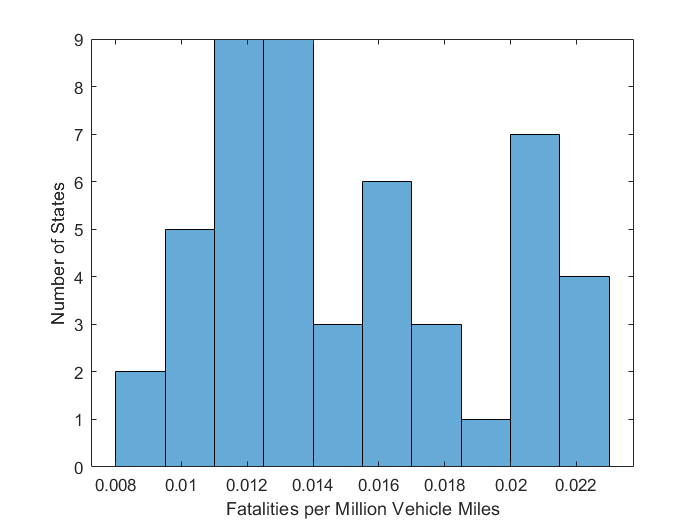
Distribution of Fatalities
You can include visualizations in your program. Like output, plots and figures appear together with the code that produced them.
We can use a bar chart to see the distribution of fatality rates among the states. There are 11 states that have a fatality rate greater than 0.02 per million vehicle miles.
histogram(rate,10)
xlabel('Fatalities per Million Vehicle Miles')
ylabel('Number of States')
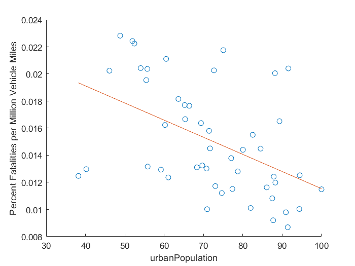
Find Correlations in the Data
You can explore your data quickly in the Live Editor by experimenting with parameter values to see how your results will change. Add controls to change parameter values interactively. To add controls, go to the Live Editor tab, click the Control button, and select from the available options.
We can experiment with the data to see if any of the variables in the table are correlated with highway fatalities. For example, it appears that highway fatality rates are lower in states with a higher percentage urban population.
dataToPlot ="urbanPopulation"; close % Close any open figures scatter(fatalities.(dataToPlot),rate) % Plot fatalities vs. selected variable xlabel(dataToPlot) ylabel('Percent Fatalities per Million Vehicle Miles') hold on xmin = min(fatalities.(dataToPlot)); xmax = max(fatalities.(dataToPlot)); p = polyfit(fatalities.(dataToPlot),rate,1); % Calculate & plot least squares line plot([xmin xmax], polyval(p,[xmin xmax]))
Plot Fatalities and Urbanization on a US Map
Summarize your results and share your live script with your colleagues. Using your live script, they can recreate and extend your analysis. You can also save your analysis as HTML, Microsoft® Word, or PDF documents for publication.
Based on this analysis, we can summarize our findings using a plot of fatality rates and urban population on a map of the continental United States.
load usastates.mat
figure
geoplot([usastates.Lat], [usastates.Lon], 'black')
geobasemap darkwater
hold on
geoscatter(fatalities.latitude,fatalities.longitude,2000*rate,fatalities.urbanPopulation,'filled')
c = colorbar;
title(c,'Percent Urban')
