Visualize Central Limit Theorem in Array Plot
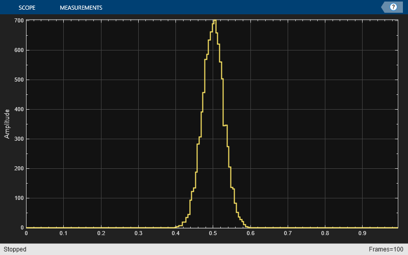
This example shows how to use and configure the dsp.ArrayPlot System object™ to visualize the Central Limit Theorem. This theorem states that if you take a large number of random samples from a population, the distribution of the means of the samples approaches a normal distribution.
Display a Uniform Distribution
The population for this example is a uniform distribution of random numbers between 0 and 1. Generate a sample set of the values in MATLAB® using the rand function. Find their distributions using the histcounts function.
numsamples = 1e4;
numbins = 20;
r = rand(numsamples,1);
hst = histcounts(r,numbins);
Create a new array plot object and configure the properties of the array plot object to plot a histogram.
scope = dsp.ArrayPlot;
scope.XOffset = 0;
scope.SampleIncrement = 1/numbins;
scope.PlotType = 'Stem';
scope.YLimits = [0, max(hst)+1];
Call the scope to plot the uniform distribution.
scope(hst')

Display the Distribution of Multiple Samples
Next, simulate the calculation of multiple uniformly distributed random samples. Because the population is a uniformly distributed set of values between 0 and 1, we can simulate the sampling and calculation of sample means by generating random values between 0 and 1. As the number of random samples increases, the distribution of the means more closely resembles a normal curve. Run the release method to let property values and input characteristics change.
hide(scope);
release(scope);
Change the configuration of the Array Plot properties for the display of a distribution function.
numbins = 201;
numtrials = 100;
r = zeros(numsamples,1);
scope.SampleIncrement = 1/numbins;
scope.PlotType = 'Stairs';
Call the scope repeatedly to plot the distribution of the samples.
show(scope);
for ii = 1:numtrials
    r = rand(numsamples,1)+r;
    hst = histcounts(r/ii,0:1/numbins:1);
    scope.YLimits = [min(hst)-1, max(hst)+1];
    scope(hst')
    pause(0.1);
end

When the simulation has finished, the Array Plot figure displays a bell curve, indicating a distribution that is close to normal.
Inspect Your Data by Zooming
The zoom tools allow you to zoom in simultaneously in the directions of both the x- and y-axes or in either direction individually. For example, to zoom in on the distribution between 0.3 and 0.7, you can use the Zoom X option.
To activate the Zoom X tool, select Tools > Zoom X, or press the corresponding toolbar button. You can determine if the Zoom X tool is active by looking for an indented toolbar button or a check mark next to the Tools > Zoom X menu option.
Next, zoom in on the region between 0.3 and 0.7. In the Array Plot window, click on the 0.3-second mark and drag to the 0.7-second mark.