dsp.ArrayPlot
Display vectors or arrays
Description
Display vectors or arrays where the data is uniformly spaced along the x-axis.

Creation
Description
scope = dsp.ArrayPlot creates an Array Plot object,
scope.
scope = dsp.ArrayPlot(Name=Value) sets
properties using one or more name-value pairs. For example, to specify
the number of input ports as 3, set NumInputPorts
to 3.
Properties
Most properties can be changed from the dsp.ArrayPlot UI.
Plot Configuration
Number of input ports, specified as a positive integer. Each signal coming through a separate input becomes a separate channel in the scope. You must invoke the scope with the same number of inputs as the value of this property.
Specify whether to use the SampleIncrement and XOffset
property values to determine spacing, or specify your own custom spacing. If you
specify "Custom", you also must specify the CustomXData
property values.
You can set this property only when creating the object.
Scope Window Use
Open the Scope tab, click Settings, and set X-Data Mode.
Data Types: char | string
x-data values, specified as a vector or a matrix (since R2026a) of size
N-by-L, where N is the
number of input ports that you specify in the NumInputPorts
property and L is the frame length of the individual inputs.
If you use the default value [], the x-data
is uniformly spaced and is set to (0:L–1).
You can set this property only when creating the object.
To use this property, set XDataMode to
"Custom".
Example: scope =
dsp.ArrayPlot(XDataMode="Custom",CustomXData=logspace(0,log10(44100/2),1024))
Tunable: Yes
Scope Window Use
Open the Scope tab, click Settings, and set X-Data Mode to Custom and specify Custom X-Data.
Spacing between samples along the x-axis, specified as a finite
numeric scalar or a vector (since R2026a) of length equal to the
number of inputs. The input signal is only y-axis data.
x-axis data is set automatically based on the XOffset and
SampleIncrement properties.
To use this property, set XDataMode to "Sample increment and X-offset".
Example: When XOffset is 0 and
SampleIncrement is 1, the x-axis values are
set to 0, 1, 2, 3, 4, … .
Example: When XOffset is −1 and
SampleIncrement is [0.25
0.5] (since R2026a), the x-axis values for the first input are set to
−1, −0.75, −0.5, −0.25, 0, …, and the x-axis values for the second
input are set to −1, −0.5, 0, 0.5, 1.0, … .
Example: When XOffset is −1 and
SampleIncrement is 0.25, the x-axis values
are set to −1, −0.75, −0.5, −0.25, 0, … .
Tunable: Yes
Scope Window Use
Open the Scope tab, click Settings, and set Sample Increment.
Display offset of x-axis, specified as a numeric scalar or a
vector (since R2026a) of length equal to the number of inputs.
x-axis data is set automatically based on both the SampleIncrement and XOffset values. The x-offset
represents the first value on the x-axis.
Example: When XOffset is 0 and SampleIncrement is 1, the x-axis values are set to 0,
1, 2, 3, 4, … .
Example: When XOffset is [0
10] (since R2026a) and SampleIncrement is 1, the
x-axis values for the first input are set to 0, 1, 2, 3, …, and the
x-axis values for the second input are set to 10, 11, 12, 13, 14,
… .
Example: When XOffset is −1 and SampleIncrement is 0.25, the x-axis values are set to
−1, −0.75, −0.5, −0.25, 0, … .
Tunable: Yes
Scope Window Use
Open the Scope tab, click Settings, and set X-Offset.
Dependency
To use this property, set XDataMode to "Sample increment and
X-offset".
Specify whether the scale of the x-axis is "Linear" or "Log". If XOffset is a negative value, you cannot set this property to "Log".
Scope Window Use
Open the Scope tab, click Settings, and set X-Scale.
Data Types: char | string
Specify whether the scale of the y-axis is
"Linear" or "Log".
Scope Window Use
Open the Scope tab, click Settings, and set Y-Scale.
Data Types: char | string
Type of plot to use for all the input signals displayed in the scope window, specified as one of these:
"Stem"– The scope displays the input signal as circles with vertical lines extending down to the x-axis at each of the sampled values."Line"– The scope displays the input signal as lines connecting each of the sampled values."Stairs"– The scope displays the input signal as a stair-step graph. A stair-step graph is made up of only horizontal lines and vertical lines. Each horizontal line represents the signal value for a discrete sample period and is connected to two vertical lines. Each vertical line represents a change in values occurring at a sample. Stair-step graphs are useful for drawing time history graphs of digitally sampled data."Bar"–– The scope displays the input signal with rectangular bars, where bar lengths are proportional to the signal values. (since R2024b)
You can individually control the type of plot
for each line by specifying the PlotType property as a cell array
of character vectors. (since R2025a)
Tunable: Yes
Scope Window Use
Open the Scope tab, click Settings, and set Plot Type.
Since R2024b
Baseline value of the stem or bar plot, specified as a real scalar. If you specify
-Inf, the minimum value of the bar plot is not constrained to any
value.
Tunable: Yes
Dependencies
To enable this property, set PlotType to
"Stem" or "Bar".
Specify when the scope scales the axes. Valid values are:
"Auto"— The scope scales the axes as needed to fit the data, both during and after simulation."Manual"— The scope does not scale the axes automatically."OnceAtStop"— The scope scales the axes when the simulation stops."Updates"— The scope scales the axes once after a set number of visual updates. The number of updates is determined by the value of theAxesScalingNumUpdatesproperty.
You can set this property only when creating the object.
Scope Window Use
Hover over the array plot to see the zoom ![]() , pan
, pan ![]() , and autoscale
, and autoscale ![]() buttons. You can also zoom and pan using your mouse.
buttons. You can also zoom and pan using your mouse.
Data Types: char | string
Specify the number of updates before scaling as a real, positive scalar integer.
Dependency
To enable this property, set AxesScaling to
"Updates".
Data Types: double
Measurements
Channel for which to obtain measurements, specified as a positive integer in the range [1 N], where N is the number of input channels.
Scope Window Use
Click the Measurements tab on the Array Plot toolstrip. In the Channel section, select a Channel.
Data Types: double
Cursor measurements to display screen or waveform cursors, specified as a CursorMeasurementsConfiguration object.
All CursorMeasurementsConfiguration properties are
tunable.
Scope Window Use
Click the Measurements tab on the Array Plot toolstrip and modify the cursor measurements in the Cursors section.
Peak finder measurements to compute and display the largest calculated peak
values, specified as a PeakFinderConfiguration object.
All PeakFinderConfiguration
properties are tunable.
Scope Window Use
Click the Measurements tab on the Array Plot toolstrip and modify the peak finder measurements in the Peaks section.
Signal statistics measurements to compute and display signal statistics, specified
as a SignalStatisticsConfiguration object.
All
SignalStatisticsConfiguration properties are tunable.
Scope Window Use
Click the Measurements tab on the Array Plot toolstrip and modify the signal statistics measurements in the Statistics section.
Visualization
Specify the name of the scope. This name appears as the title of the scope's figure window. To
specify a title of a scope plot, use the
Title property.
Data Types: char | string
Specify, in pixels, the size and location of the scope window as a four-element vector of the form [left
bottom width height]. By default, the scope window appears in the center of your screen with a width of 800
pixels and height of 450 pixels. The default values for this property may change depending on your screen resolution.
Specify whether to display the scope in maximized-axes mode. In this mode, the axes are expanded to fit into the entire display. To conserve space, labels do not appear in each display. Instead, tick-mark values appear on top of the plotted data. You can select one of the following options:
"Auto"— The axes appear maximized in all displays only if theTitleandYLabelproperties are empty for every display. If you enter any value in any display for either of these properties, the axes are not maximized."On"— The axes appear maximized in all displays. Any values entered into theTitleandYLabelproperties are hidden."Off"— None of the axes appear maximized.
Scope Window Use
Hover over the array plot to see the maximize axes button ![]() .
.
Data Types: char | string
Since R2024b
Dimensions of the display grid layout, specified as a two-element numeric vector.
The grid can have a maximum of 10 rows and 10 columns. When you specify
[2
2], for example, the scope shows four displays arranged in a 2-by-2
matrix.
If you create a grid of multiple axes, to modify the settings of the individual
axes, use the ActiveDisplay property.
Tunable: Yes
Scope Window Use
Open the Scope tab, click Display Grid, and select a layout.
Since R2024b
Active display, specified as an integer display number. The settings in the
YLimits, XLabel,
YLabel, ShowLegend,
ShowGrid, Title, and
PlotAsMagnitudePhase properties affect only the active display
that you specify using this property.
The number of the display corresponds to the row-wise placement index of the
display. To control the layout of the display, use the
LayoutDimensions property.
Tunable: Yes
Scope Window Use
Open the Scope tab, click Settings, and set Active Display.
true– The scope plots the magnitude and phase of the input signal on two separate axes within the same active display.false– The scope plots the real and imaginary parts of the input signal on two separate axes within the same active display.
This property is useful for complex-valued input signals. Turning on this property affects the phase for real-valued input signals. When the amplitude of the input signal is nonnegative, the phase is 0 degrees. When the amplitude of the input signal is negative, the phase is 180 degrees.
Scope Window Use
On the Scope tab, click Settings, and select Magnitude Phase Plot.
Specify the display title as a character vector or string.
Scope Window Use
On the Scope tab, click Settings, and set Title.
Data Types: char | string
Specify the text for the scope to display below the x-axis.
Scope Window Use
On the Scope tab, click Settings, and set X-Label.
Data Types: char | string
Specify the text for the scope to display to the left of the y-axis.
Dependencies
This property applies only when PlotAsMagnitudePhase is false. When PlotAsMagnitudePhase is true, the two y-axis labels are read-only values "Magnitude" and "Phase", for the magnitude plot and the phase plot, respectively.
Scope Window Use
On the Scope tab, click Settings, and set Y-Label.
Data Types: char | string
Specify the y-axis limits as a two-element numeric vector, [ymin, ymax].
If PlotAsMagnitudePhase is false, the default is [-10,10]. If PlotAsMagnitudePhase is true, the default is [0,10].
Dependencies
When PlotAsMagnitudePhase is true, this property specifies the y-axis limits of only the magnitude plot. The y-axis limits of the phase plot are always [-180,180].
Scope Window Use
On the Scope tab, click Settings, and set Y-Limits as a two-element numeric vector.
To show a legend with the input names, set this property to true.
From the legend, you can control which signals are visible. This control is equivalent to changing the visibility in the Style dialog box. In the scope legend, click a signal name to hide the signal in the scope. To show the signal, click the signal name again. To show only one signal, right-click the signal name. To show all signals, press Esc.
Note
The legend only shows the first 20 signals. Any additional signals cannot be viewed or controlled from the legend.
Scope Window Use
On the Scope tab, click Legend. Alternatively, click Settings in the Scope tab, and select Show Legend.
Data Types: logical
Specify the input channel names as a cell array of character vectors or an array of strings.
The names appear in the legend, Settings, and
Measurements panels. If you do not specify names, the channels
are labeled as Channel 1, Channel 2, etc.
Dependency
To see channel names, set ShowLegend to true.
Data Types: char
Set this property to true to show grid lines on the plot.
Scope Window Use
On the Scope tab, click Settings, and select Show Grid.
Color and Styling
Since R2024b
Background color in scope, specified as an RGB triplet, a hexadecimal color code, a color name, or a short name. For more information on all the acceptable values, see Color.
Tunable: Yes
Scope Window Use
On the Scope tab, click Settings, and select a Background color.
Data Types: double | char
Since R2024b
Color of the axes in the scope, specified as an RGB triplet, a hexadecimal color code, a color name, or a short name. For more information on all the acceptable values, see Color.
Tunable: Yes
Scope Window Use
On the Scope tab, click Settings, and select an Axes color.
Data Types: double | char
Since R2024b
Colors of the labels in the scope, specified as an RGB triplet, a hexadecimal color code, a color name, or a short name. Use this property to set the color of the scope title, x-axis and y-axis labels, and the axes ticks. For more information on all the acceptable values, see Color.
Tunable: Yes
Scope Window Use
On the Scope tab, click Settings, and select a Labels color.
Data Types: double | char
Since R2024b
Scope font size, specified as a positive scalar. Use this property to set the font size for the ticks, labels, title, and measurements of the scope.
Tunable: Yes
Scope Window Use
On the Scope tab, click Settings, and set the Font Size to one of the available values.
Data Types: single | double | int8 | int16 | int32 | int64 | uint8 | uint16 | uint32 | uint64
Since R2024b
Visibility of plot lines in scope, specified as one of these:
"on"or 1 –– The scope displays the plot line. If you are plotting multiple lines, the scope applies this value to all the lines."off"or 0 –– The scope hides the plot line. If you are plotting multiple lines, the scope applies this value to all the lines.vector of logical values –– The scope applies the values to the lines in the plot. The length of the vector must equal the number of lines that you are plotting in the scope.
Tunable: Yes
Scope Window Use
On the Scope tab, click Settings, and select the Visible property.
Data Types: logical
Since R2024b
Scope line style, specified as one of these options:
"-"–– Solid line"--"–– Dashed line":"–– Dotted line"-."–– Dash-dotted line"none"–– No line
If you provide a cell array or an array of these values, then the length of the array must equal the number of lines that you are plotting in the scope.
Tunable: Yes
Scope Window Use
On the Scope tab, click Settings, and set Style.
Since R2024b
Scope line width, specified as a positive scalar or a vector of positive scalar values in points, where 1 point = 1/72 of an inch. If you specify a scalar value and are plotting multiple lines, then the scope applies the same value to all the lines. If you provide a vector of values, the length of the vector must equal the number of lines that you are plotting.
If the line has markers, then the line width also affects the marker edges. The line width cannot be thinner than the width of a pixel. If you set the line width to a value that is less than the width of a pixel on your system, the line displays as one pixel wide.
Tunable: Yes
Scope Window Use
On the Scope tab, click Settings, and set Width.
Data Types: single | double | int8 | int16 | int32 | int64 | uint8 | uint16 | uint32 | uint64
Since R2024b
Relative width of individual bars in a bar plot, specified as a scalar value in
the range [0,1]. Use this property to control
the separation of bars within a group. The default value of 0.9 separates the bars
slightly. If you set this property to 1, then adjacent bars touch.
Tunable: Yes
Dependencies
To enable this property, set PlotType to
"Bar".
Scope Window Use
Open the Scope tab, click Settings, and set Width.
Since R2024b
Scope line color, specified as a matrix of RGB triplets or an array of color names.
Matrix of RGB Triplets
Specify an m-by-3 matrix, where each row is an RGB triplet. An RGB triplet is a three-element vector containing the intensities of the red, green, and blue components of a color. The intensities must be in the range [0,1]. For example, this matrix defines the new colors as blue, dark green, and orange.
scope.LineColor = [1.0 0.0 0.0
                0.0 0.4 0.0
                1.0 0.5 0.0];
Array of Color Names or Hexadecimal Color Codes
Specify any combination of color names, short names, or hexadecimal color codes.
To specify one color, set the line color to a character vector or a string scalar. For example,
scope.LineColor =
                "red"
specifies red as the only color in the color order.To specify multiple colors, set
LineColorto a cell array of character vectors or a string array. For example,scope.LineColor = {"red","green","blue"}specifies red, green, and blue as the colors.
A hexadecimal color code starts with a hash symbol
(#) followed by three or six hexadecimal digits,
which can range from 0 to F. The
values are not case sensitive. Thus, the color codes
"#FF8800", "#ff8800",
"#F80", and "#f80" are
equivalent.
This table lists the color names and short names with the equivalent RGB triplets and hexadecimal color codes.
| Color Name | Short Name | RGB Triplet | Hexadecimal Color Code | Appearance |
|---|---|---|---|---|
"red" | "r" | [1 0 0] | "#FF0000" |
|
"green" | "g" | [0 1 0] | "#00FF00" |
|
"blue" | "b" | [0 0 1] | "#0000FF" |
|
"cyan"
| "c" | [0 1 1] | "#00FFFF" |
|
"magenta" | "m" | [1 0 1] | "#FF00FF" |
|
"yellow" | "y" | [1 1 0] | "#FFFF00" |
|
"black" | "k" | [0 0 0] | "#000000" |
|
"white" | "w" | [1 1 1] | "#FFFFFF" |
|
Scope Window Use
On the Scope tab, click Settings, and set Color.
Tunable: Yes
Data Types: single | double | char | string | cell
Since R2024b
Scope line marker symbol, specified as one of the values listed in this table. By default, the object does not display markers. Specifying a marker symbol adds markers at each data point or vertex.
Tunable: Yes
Scope Window Use
On the Scope tab, click Settings, and set Marker.
Usage
Description
Input Arguments
Object Functions
To use an object function, specify the object as the first input argument.
If you want to restart the simulation from the beginning, call reset to
clear the scope window displays. Do not call reset after calling
release.
Examples
Create a new dsp.ArrayPlot object.
scope = dsp.ArrayPlot;
Configure the properties of the object for a Gaussian distribution. Use a bar plot to plot the distribution.
scope.YLimits = [0 1];
scope.XOffset = -2.5;
scope.SampleIncrement = 0.1;
scope.Title = "Gaussian distribution";
scope.XLabel = "X";
scope.YLabel = "f(X)";
scope.PlotType = "Bar";
Call the dsp.ArrayPlot object to plot a Gaussian distribution.
scope(exp(-(-2.5:.1:2.5).*(-2.5:.1:2.5))')

You can scale the y-axis to show the plot on a log scale. In addition, you can change the background color and axes color of the scope to white, and font color to black.
release(scope)
scope.YScale = "Log";
scope.BackgroundColor="white";
scope.AxesColor="white";
scope.FontColor="black";
scope(exp(-(-2.5:.1:2.5).*(-2.5:.1:2.5))')

Since R2023b
Use the printToFigure function to print the dsp.ArrayPlot object display window to a new MATLAB® figure.
Create a dsp.ArrayPlot object.
scope=dsp.ArrayPlot;
Set ArrayPlot properties to display a Gaussian distribution.
scope.YLimits = [-0.1 1.1];
scope.XOffset = -2.5;
scope.SampleIncrement = 0.1;
scope.Title = "Gaussian distribution";
scope.XLabel = "X";
scope.YLabel = "f(X)";
Plot the Gaussian distribution.
scope(exp(-(-2.5:.1:2.5) .* (-2.5:.1:2.5))');

Change the background color and the axes color of the plot to "white". Set the font color to "black" and the line color to "blue".
scope.BackgroundColor = "white";
scope.AxesColor = "white";
scope.FontColor = "black";
scope.LineColor = "blue";
show(scope)
release(scope)

Print the display of the Gaussian distribution to a new MATLAB figure. The function returns a handle to the figure.
scopeFig = printToFigure(scope);

The handle to the figure scopeFig lets you modify the appearance and the behavior of the figure window.
Specify a figure name and change the size of the figure to 400-by-250 pixels.
scopeFig.Name="Gaussian Distribution";
scopeFig.NumberTitle="off";
scopeFig.Position=[1 1 400 250];

When printing to figure, you can make the figure invisible by setting the Visible argument to false.
scopeFig = printToFigure(scope,Visible=false);
Since R2024b
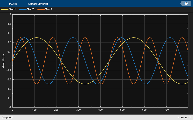
Create a dsp.ArrayPlot object. The input to the object is a sinusoidal signal with three channels.
ap = dsp.ArrayPlot(PlotType="line",YLimits=[-2 2],...
    ChannelNames = ["Sine1","Sine2","Sine3"]);
sineSignal = dsp.SineWave(Frequency = [100 200 300],...
    SamplesPerFrame=800,SampleRate=44.1e3);
Plot the signal on the array plot. This plot shows the default color and style settings of the object.
input = sineSignal();
ap(input)
release(ap);
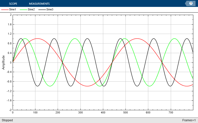
Change the background color and the axes color of the plot to "white". Set the font color to "black" and change the line colors to ["red" "green" "black"].
ap.BackgroundColor = "white";
ap.AxesColor = "white";
ap.FontColor = "black";
ap.LineColor = ["red" "green" "black"];
show(ap)
release(ap)
To change the color order, set LineColor to a different color order. This setting changes the color order palette.
ap.LineColor = colororder("glow");
show(ap)
release(ap)
You can further specify a marker for each line and change the corresponding line width.
ap.LineMarker = ["x","o","+"];
ap.LineWidth = 2;
show(ap)
release(ap)

To control the visibility of the plot lines, use the LineVisible property. When you select "off", the plot line becomes invisible.
ap.LineVisible = ["off" "on" "on"];
show(ap)
release(ap)

Since R2026a
Customize the x-data, sample increment, and x-offset properties separately for each input signal in the dsp.ArrayPlot object.
Customize x-Data
Create a dsp.ArrayPlot object. Set the CustomXData property to a matrix of size 2-by-10. The object applies the first row of the custom x-data to the first input signal and second row of the custom x-data to the second input signal.
View the signals in the array plot display. Note the x-data for each signal.
f = [1:10:100;[2:20:100 NaN.*ones(1,5)]];
ap = dsp.ArrayPlot(2,XDataMode="Custom",CustomXData=f);
ap(randn(10,1),randn(10,1));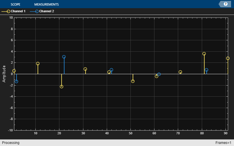
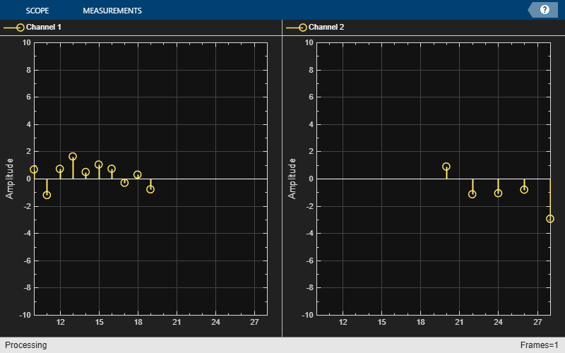
Customize x-Offset and Sample Increment
Set the XOffset property to [10 20] and the SampleIncrement property to [1 2]. The object applies an x-offset of 10 and a sample increment of 1 to the first input signal, an x-offset of 20 and a sample increment of 2 to the second input signal. Set the dimensions of the display layout to [1 2].
ap = dsp.ArrayPlot(2,XOffset=[10 20],...
SampleIncrement=[1 2],LayoutDimensions=[1 2]);
Plot the two signals on the individual displays. Note the x-offset and the sample increment (spacing between samples) for each signal.
ap(randn(10,1),randn(5,1))
View least mean squares (LMS) adaptive filter weights on the Array Plot figure. Watch the filter weights change as they adapt to filter a noisy input signal.
Create an LMS adaptive filter System object™.
lmsFilter = dsp.LMSFilter(40,Method="Normalized LMS",...
    StepSize=0.002);
Create and configure a dsp.AudioFileReader System object to read the input signal from the specified audio file.
signalSource = dsp.AudioFileReader("dspafxf_8000.wav",...
    SamplesPerFrame=40, ...
    PlayCount=Inf,...
    OutputDataType="double");
Create and configure a dsp.FIRFilter System object to filter random white noise, creating colored noise.
firFilter = dsp.FIRFilter(Numerator=fir1(39,0.25));
Create and configure a dsp.ArrayPlot object to display the adaptive filter weights.
scope = dsp.ArrayPlot(XLabel="Filter Tap", ...
    YLabel="Filter Weight", ...
    YLimits=[-0.05 0.2]');
Plot the LMS filter weights as they adapt to a desired signal. Read from the audio file, produce random data, and filter the random data. Update the filter weights and plot the filter weights.
numplays = 0;
while numplays < 3
    [y, eof]    = signalSource();
    noise       = rand(40,1);
    noisefilt   = firFilter(noise);
    desired     = y + noisefilt;
    [~, ~, wts] = lmsFilter(noise,desired);
    scope(wts);
    numplays = numplays + eof;
end

Compute the power spectrum of a multichannel sinusoidal signal using the dsp.SpectrumEstimator System object™. You can get the vector of frequencies at which the spectrum is estimated using the getFrequencyVector function. To compute the resolution bandwidth of the estimate (RBW), use the getRBW function.
Generate a three-channel sinusoid sampled at 1 kHz. Specify sinusoidal frequencies of 100, 200, and 300 Hz. The second and third channels have their phases offset from the first by  and
and  , respectively.
sineSignal = dsp.SineWave(SamplesPerFrame=1000,SampleRate=1000, ...
    Frequency=[100 200 300],PhaseOffset=[0 pi/2 pi/4]);
Estimate and plot the one-sided spectrum of the signal. Use the dsp.SpectrumEstimator object for the computation and the dsp.ArrayPlot for the plotting.
estimator = dsp.SpectrumEstimator(FrequencyRange="onesided");
plotter = dsp.ArrayPlot(PlotType="Line",YLimits=[0 0.75], ...
    YLabel="Power Spectrum (watts)",XLabel="Frequency (Hz)");
Step through to obtain the data streams and display the spectra of the three channels.
y = sineSignal();
pxx = estimator(y);
plotter(pxx)

Get the vector of frequencies at which the spectrum is estimated in Hz, using the getFrequencyVector function.
f = getFrequencyVector(estimator);
Compute the resolution bandwidth (RBW) of the estimate using the getRBW function.
getRBW(estimator)
ans =

    0.0015
The resolution bandwidth of the signal power spectrum is 0.0015 Hz. This frequency is the smallest frequency that can be resolved on the spectrum.
Generate a sine wave.
sineWave = dsp.SineWave(Frequency=100,...
    SampleRate=1000, ...
    SamplesPerFrame=1000);
Use the spectrum estimator to compute the power spectrum and the max-hold spectrum of the sine wave. Use the Array Plot to display the spectra.
SE = dsp.SpectrumEstimator(...
    SampleRate=sineWave.SampleRate,...
    SpectrumType="Power",PowerUnits="dBm", ...
    FrequencyRange="centered",...
    OutputMaxHoldSpectrum=true);
plotter = dsp.ArrayPlot(PlotType="Line",...
    XOffset=-500, ...
    YLimits=[-60 30],...
    Title="Power Spectrum of 100 Hz Sine Wave", ...
    YLabel="Power Spectrum (dBm)",...
    XLabel="Frequency (Hz)");
Add random noise to the sine wave. Stream in the data, and plot the power spectrum of the signal.
for ii = 1:10
    x = sineWave() + 0.05*randn(1000,1);
    [Pxx,Pmax] = SE(x);
    plotter([Pxx Pmax])
end

Limitations
Does not support C/C++ code generation using MATLAB® Coder™. To generate a standalone application, use the MATLAB Compiler™.
Supports MEX code generation by treating the calls to the object as extrinsic.