viewer2d
Description
viewer = viewer2dViewer object in a new figure window that is configured for 2-D image
display. Use viewer to query and modify properties of the
Viewer object after you create the object. For a list of properties, see
Viewer Properties.
viewer = viewer2d(___,Name=Value)Viewer object and sets properties of the object using one or more
name-value arguments in addition to any of the input arguments from previous
syntaxes.
For example, viewer2d(BackgroundColor="green") creates a
Viewer object in a new web figure with a green background.
Examples
Create a viewer configured for 2-D image display. The viewer2d function creates a new Viewer object with default property values suitable for 2-D images.
viewer = viewer2d
viewer =
  Viewer with properties:

                Parent: [1×1 Figure]
              Position: [1 1 560 420]
              Children: [0×0 GraphicsPlaceholder]

       BackgroundColor: [1 1 1]
    BackgroundGradient: off
         GradientColor: [1 1 1]
       OrientationAxes: off
        ClippingPlanes: [0×4 single]
              Lighting: on
         LightPosition: [0 0 0]

        CameraPosition: [1 1 1]
          CameraTarget: [0 0 0]
        CameraUpVector: [0 0 1]
            CameraZoom: 1

  Show all properties
Add an image to the viewer using the imageshow function with the Parent name-value argument specified as the handle to the Viewer object.
im = imageshow("peppers.png",Parent=viewer);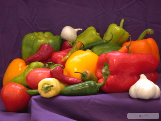
Optionally, show the scale bar.
viewer.ScaleBar = "on";
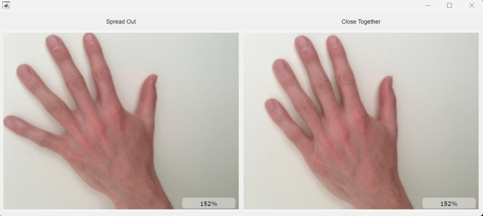
Create a grid layout with one row and two columns. The layout opens in a new figure outside of the Live Editor.
h = uifigure(Position=[100 100 1000 420]);
g = uigridlayout(h,ColumnWidth={'1x','1x'},RowHeight={'fit','1x'});
Create two viewers to display 2-D images.
viewerLeft = viewer2d(g);
viewerRight = viewer2d(g);
Specify the title for each grid element.
labelLeft = uilabel(g,Text="Spread Out",HorizontalAlignment="center");
labelRight = uilabel(g,Text="Close Together",HorizontalAlignment="center");
Specify the layout options for the grid. Nest the left viewer and its label in the first column. Nest the right viewer and its label in the second column.
labelLeft.Layout.Row = 1;
labelLeft.Layout.Column = 1;
labelRight.Layout.Row = 1;
labelRight.Layout.Column = 2;

viewerLeft.Layout.Row = 2;
viewerLeft.Layout.Column = 1;
viewerRight.Layout.Row = 2;
viewerRight.Layout.Column = 2;
Display two images of hands side-by-side in the UI grid layout.
imageshow("hands1.jpg",Parent=viewerLeft);
imageshow("hands2.jpg",Parent=viewerRight);
This image shows how the grid layout appears in the figure window, which is displayed outside of the Live Editor.
Input Arguments
Name-Value Arguments
Specify optional pairs of arguments as
Name1=Value1,...,NameN=ValueN, where Name is
the argument name and Value is the corresponding value.
Name-value arguments must appear after other arguments, but the order of the
pairs does not matter.
Example: viewer2d(BackgroundColor="green",BackgroundGradient=false)
creates a Viewer object in a new figure with a green background and no
background gradient.
Note
The properties listed here are only a subset. For a full list, see Viewer Properties.
Color of the background, specified as an RGB triplet, a hexadecimal color code, a
color name, or a short color name. When you select light mode in MATLAB®, the default color is [0.9608 0.9608 0.9608]. When
you select dark mode in MATLAB, the default color is [0.1 0.1 0.1].
For a custom color, specify an RGB triplet or a hexadecimal color code.
An RGB triplet is a three-element row vector whose elements specify the intensities of the red, green, and blue components of the color. The intensities must be in the range
[0,1], for example,[0.4 0.6 0.7].A hexadecimal color code is a string scalar or character vector that starts with a hash symbol (
#) followed by three or six hexadecimal digits, which can range from0toF. The values are not case sensitive. Therefore, the color codes"#FF8800","#ff8800","#F80", and"#f80"are equivalent.
Alternatively, you can specify some common colors by name. This table lists the named color options, the equivalent RGB triplets, and the hexadecimal color codes.
| Color Name | Short Name | RGB Triplet | Hexadecimal Color Code | Appearance |
|---|---|---|---|---|
"red" | "r" | [1 0 0] | "#FF0000" |
|
"green" | "g" | [0 1 0] | "#00FF00" |
|
"blue" | "b" | [0 0 1] | "#0000FF" |
|
"cyan"
| "c" | [0 1 1] | "#00FFFF" |
|
"magenta" | "m" | [1 0 1] | "#FF00FF" |
|
"yellow" | "y" | [1 1 0] | "#FFFF00" |
|
"black" | "k" | [0 0 0] | "#000000" |
|
"white" | "w" | [1 1 1] | "#FFFFFF" |
|
This table lists the default color palettes for plots in the light and dark themes.
| Palette | Palette Colors |
|---|---|
Before R2025a: Most plots use these colors by default. |
|
|
|
You can get the RGB triplets and hexadecimal color codes for these palettes using the
orderedcolors
and rgb2hex
functions. For example, get the RGB triplets for the "gem" palette and
convert them to hexadecimal color
codes.
RGB = orderedcolors("gem");
H = rgb2hex(RGB);
Before R2023b: Get the RGB triplets using RGB =
get(groot,"FactoryAxesColorOrder").
Example: BackgroundColor="r"
Example: BackgroundColor="green"
Example: BackgroundColor=[0 0.4470 0.7410]
Example: BackgroundColor="#FF8800"
Since R2025a
Title for the viewer, specified as a string scalar or character vector. The title appears in the top center of the viewer window.
Spatial units for the viewer, specified as a string scalar. Use this value to change the units label associated with viewer display tools, such as the scale bar and point and line annotations.
Display scale bar in the lower-right corner, specified as
Control the style of the scale bar by using the ScaleBarStyle
value.
Since R2025a
Style of the scale bar, specified as one of the strings in the table. Control the
visibility of the scale bar by using the ScaleBar
value.
| Value | Description |
|---|---|
"zoom" | Display a scale bar with the zoom level of the image. The zoom level is
based on a combination of available screen size, the image size, and the
viewer camera zoom level. A scale bar zoom level of
100% indicates that one screen pixel displays one
data pixel, or one unit in world coordinates if you specify the
Transformation property of the Image
object. |
"measure" | Display a measurement scale bar with units specified by the
SpatialUnits value. |
Output Arguments
More About
The 2-D image viewer provides these tools for exploring and modifying the image display.
| Tool | Description | Representative Image |
|---|---|---|
| View pixel information | The viewer displays information about the pixel beneath the pointer. The display includes a zoomed in view of the pixel neighborhood, pixel coordinates, grayscale intensity or RGB color values, and the overlay value, if one is specified. To interactively toggle the visibility of the display, open the context menu by right-clicking inside the viewer, and select or clear Display info. Alternatively, you can toggle the visibility programmatically by setting the You can copy or export the pixel information from the viewer context menu. To save individual values to the clipboard, select Copy intensity, Copy color, or Copy location. To save the pixel information as a structure in the workspace, select Export info to workspace. In the Export to workspace dialog box, specify a name for the structure and select OK. |
|
| Copy or save screenshot | To save a screenshot of the displayed image without the toolbar or scale bar, right-click to open the viewer context menu, and select Copy screenshot to clipboard or Save screenshot to file. |
|
| Adjust the display range of grayscale images | From the viewer toolbar, select the adjust window level icon The viewer hides the window level tool when displaying binary or RGB images. | |
| Annotate Regions of Interest (ROIs) | From the viewer toolbar, click the draw annotations icon Click and drag in the image to draw an ROI annotation.
Each shape displays a label, such as the coordinates of a point or the
length of a line, with the units label specified by the Right-click the ROI to open a context menu from which you can edit the text label, remove the ROI, or export the line to the workspace as an object. |
Tips
To clear all objects from the scene and delete all data containers previously added to the 2-D viewer
viewer, use the command:clear(viewer)
To delete all objects in the scene and the 2-D viewer
viewer, use the command:delete(viewer)
Version History
Introduced in R2024bSee Also
Viewer Properties | linkviewers | imageshow | viewer3d | viewangle | uidraw | uipaint