plotAdded
Added variable plot of linear regression model
Syntax
Description
plotAdded( creates an added variable plot for the whole model
mdl)mdl except the constant (intercept) term.
plotAdded(
specifies graphical properties of adjusted data points using one or more
name-value pair arguments. For example, you can specify the marker symbol and
size for the data points.mdl,coef,Name,Value)
plotAdded(
creates the plot in the axes specified by ax,___)ax instead of the
current axes, using any of the input argument combinations in the previous
syntaxes.
h = plotAdded(___)h to modify the
properties of a specific line after you create the plot. For a list of
properties, see Line Properties.
Examples
Create a linear regression model of car mileage as a function of weight and model year. Then create an added variable plot to see the significance of the model.
Create a linear regression model of mileage from the carsmall data set.
load carsmall
Year = categorical(Model_Year);
tbl = table(MPG,Weight,Year);
mdl = fitlm(tbl,'MPG ~ Year + Weight^2');
Create an added variable plot of the model.
plot(mdl)

The plot illustrates that the model is significant because a horizontal line does not fit between the confidence bounds.
Create the same plot by using the plotAdded function.
plotAdded(mdl)

Create a linear regression model of car mileage as a function of weight and model year. Then create an added variable plot to see the effect of the weight terms (Weight and Weight^2).
Create the linear regression model using the carsmall data set.
load carsmall
Year = categorical(Model_Year);
tbl = table(MPG,Weight,Year);
mdl = fitlm(tbl,'MPG ~ Year + Weight^2');
Find the terms in the model corresponding to Weight and Weight^2.
mdl.CoefficientNames
ans = 1×5 cell
    {'(Intercept)'}    {'Weight'}    {'Year_76'}    {'Year_82'}    {'Weight^2'}
The weight terms are 2 and 5.
Create an added variable plot with the weight terms.
coef = [2 5];
plotAdded(mdl,coef)
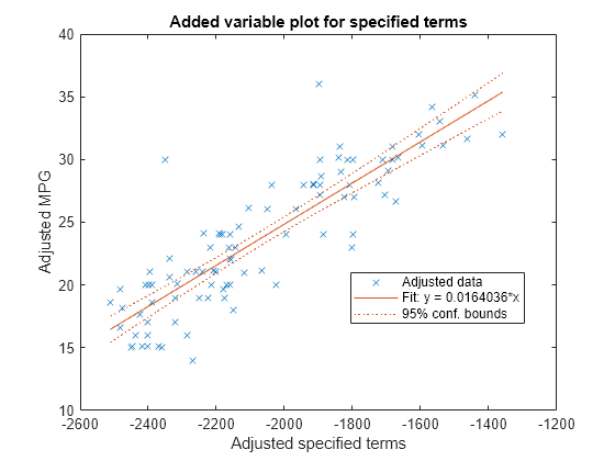
The plot illustrates that the weight terms are significant because a horizontal line does not fit between the confidence bounds.
Create a scatter plot of data along with a fitted curve and confidence bounds for a simple linear regression model. A simple linear regression model includes only one predictor variable.
Create a simple linear regression model of mileage from the carsmall data set.
load carsmall
tbl = table(MPG,Weight);
mdl = fitlm(tbl,'MPG ~ Weight')
mdl =
Linear regression model:
    MPG ~ 1 + Weight

Estimated Coefficients:
                    Estimate        SE         tStat       pValue
                   __________    _________    _______    __________

    (Intercept)        49.238       1.6411     30.002    2.7015e-49
    Weight         -0.0086119    0.0005348    -16.103    1.6434e-28


Number of observations: 94, Error degrees of freedom: 92
Root Mean Squared Error: 4.13
R-squared: 0.738,  Adjusted R-Squared: 0.735
F-statistic vs. constant model: 259, p-value = 1.64e-28
pValue of the Weight variable is very small, which means that the variable is statistically significant in the model. Visualize this result by creating a scatter plot of the data, along with a fitted curve and its 95% confidence bounds, using the plot function.
plot(mdl)
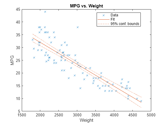
The plot illustrates that the model is significant because a horizontal line does not fit between the confidence bounds, which is consistent with the pValue result.
Create the same plot by using the plotAdded function.
plotAdded(mdl)
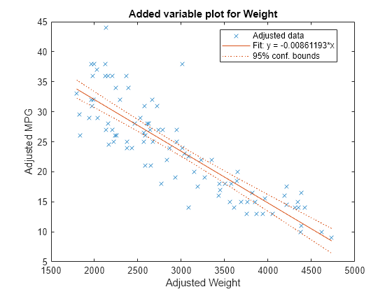
When a model includes only one term in addition to the constant term, an adjusted value is equivalent to its original value. Therefore, this added variable plot is the same as the scatter plot created by the plot function.
Input Arguments
Name-Value Arguments
Specify optional pairs of arguments as
Name1=Value1,...,NameN=ValueN, where Name is
the argument name and Value is the corresponding value.
Name-value arguments must appear after other arguments, but the order of the
pairs does not matter.
Before R2021a, use commas to separate each name and value, and enclose
Name in quotes.
Example: 'Color','blue','Marker','*'
Note
The graphical properties listed here are only a subset. For a complete list, see Line Properties. The specified properties determine the appearance of adjusted data points.
Line color, specified an RGB triplet, hexadecimal color code, color name, or short name for one of the color options listed in the following table.
The Color name-value argument also determines marker outline color and
marker fill color if MarkerEdgeColor is
"auto" (default) and MarkerFaceColor is
"auto".
For a custom color, specify an RGB triplet or a hexadecimal color code.
An RGB triplet is a three-element row vector whose elements specify the intensities of the red, green, and blue components of the color. The intensities must be in the range
[0,1], for example,[0.4 0.6 0.7].A hexadecimal color code is a string scalar or character vector that starts with a hash symbol (
#) followed by three or six hexadecimal digits, which can range from0toF. The values are not case sensitive. Therefore, the color codes"#FF8800","#ff8800","#F80", and"#f80"are equivalent.
Alternatively, you can specify some common colors by name. This table lists the named color options, the equivalent RGB triplets, and the hexadecimal color codes.
| Color Name | Short Name | RGB Triplet | Hexadecimal Color Code | Appearance |
|---|---|---|---|---|
"red" | "r" | [1 0 0] | "#FF0000" |
|
"green" | "g" | [0 1 0] | "#00FF00" |
|
"blue" | "b" | [0 0 1] | "#0000FF" |
|
"cyan"
| "c" | [0 1 1] | "#00FFFF" |
|
"magenta" | "m" | [1 0 1] | "#FF00FF" |
|
"yellow" | "y" | [1 1 0] | "#FFFF00" |
|
"black" | "k" | [0 0 0] | "#000000" |
|
"white" | "w" | [1 1 1] | "#FFFFFF" |
|
"none" | Not applicable | Not applicable | Not applicable | No color |
This table lists the default color palettes for plots in the light and dark themes.
| Palette | Palette Colors |
|---|---|
Before R2025a: Most plots use these colors by default. |
|
|
|
You can get the RGB triplets and hexadecimal color codes for these palettes using the orderedcolors and rgb2hex functions. For example, get the RGB triplets for the "gem" palette and convert them to hexadecimal color codes.
RGB = orderedcolors("gem");
H = rgb2hex(RGB);
Before R2023b: Get the RGB triplets using RGB =
get(groot,"FactoryAxesColorOrder").
Before R2024a: Get the hexadecimal color codes using H =
compose("#%02X%02X%02X",round(RGB*255)).
Example: Color="blue"
Data Types: single | double | string | char
Line width, specified as a positive value in points. If the line has markers, then the line width also affects the marker edges.
Example: LineWidth=0.75
Data Types: single | double
Marker symbol, specified as one of the values in this table.
| Marker | Description | Resulting Marker |
|---|---|---|
"o" | Circle |
|
"+" | Plus sign |
|
"*" | Asterisk |
|
"." | Point |
|
"x" | Cross |
|
"_" | Horizontal line |
|
"|" | Vertical line |
|
"square" | Square |
|
"diamond" | Diamond |
|
"^" | Upward-pointing triangle |
|
"v" | Downward-pointing triangle |
|
">" | Right-pointing triangle |
|
"<" | Left-pointing triangle |
|
"pentagram" | Pentagram |
|
"hexagram" | Hexagram |
|
"none" | No markers | Not applicable |
Example: Marker="+"
Data Types: string | char
Marker outline color, specified an RGB triplet, hexadecimal color code, color
name, or short name for one of the color options listed in the
Color name-value argument.
The default value "auto" uses the same color specified by using
the Color name-value argument. You can also specify
"none" for no color.
Example: MarkerEdgeColor="blue"
Data Types: single | double | string | char
Marker fill color, specified as an RGB triplet, hexadecimal color code, color name, or short
name for one of the color options listed in the Color
name-value argument. The default value "none" specifies no
color.
The "auto" value uses the same color specified by using the
Color name-value argument.
Example: MarkerFaceColor="blue"
Data Types: single | double | string | char
Marker size, specified as a positive value in points.
Example: MarkerSize=2
Data Types: single | double
Output Arguments
More About
Tips
The data cursor displays the values of the selected plot point in a data tip (small text box located next to the data point). The data tip includes the x-axis and y-axis values for the selected point, along with the observation name or number.
Alternative Functionality
A
LinearModelobject provides multiple plotting functions.When creating a model, use
plotAddedto understand the effect of adding or removing a predictor variable.When verifying a model, use
plotDiagnosticsto find questionable data and to understand the effect of each observation. Also, useplotResidualsto analyze the residuals of the model.After fitting a model, use
plotAdjustedResponse,plotPartialDependence, andplotEffectsto understand the effect of a particular predictor. UseplotInteractionto understand the interaction effect between two predictors. Also, useplotSliceto plot slices through the prediction surface.
plotAddedshows the incremental effect on the response of specified terms by removing the effects of the other terms, whereasplotAdjustedResponseshows the effect of a selected predictor in the model fit with the other predictors averaged out by averaging the fitted values. Note that the definitions of adjusted values inplotAddedandplotAdjustedResponseare not the same.
Extended Capabilities
Version History
Introduced in R2012a